Family Feud
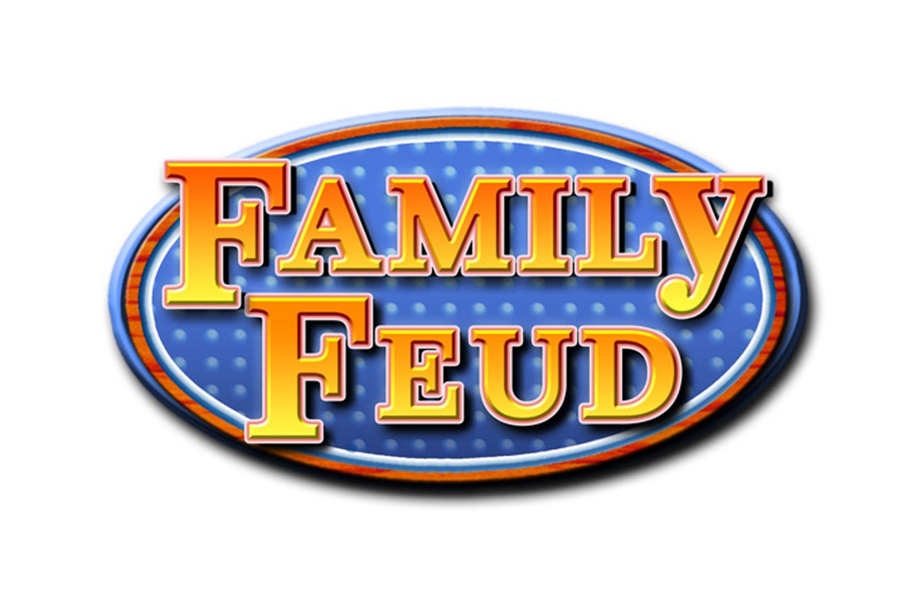
The long running game show Family Feud wanted to rebrand their outdated logo. The goal was to update the look while still being true to their brand.
The show had a down-home country feel through much of its early run. To address this visually—without feeling old-fashioned—a slab serif font was employed to give the text a country-like feel. The iconic oval background with the flashing light bulbs was used as an homage to early set design from the shows original format. Then a wood texture was added to the background’s bevel to give some contrast and further a country feel.
Conversely, the color palette was chosen to give a bit more of a modern feel to the logo. The contrasting orange and blue color combo with the pink highlights gave a nice updated, fresh feel as well as gave the text a nice pop.

